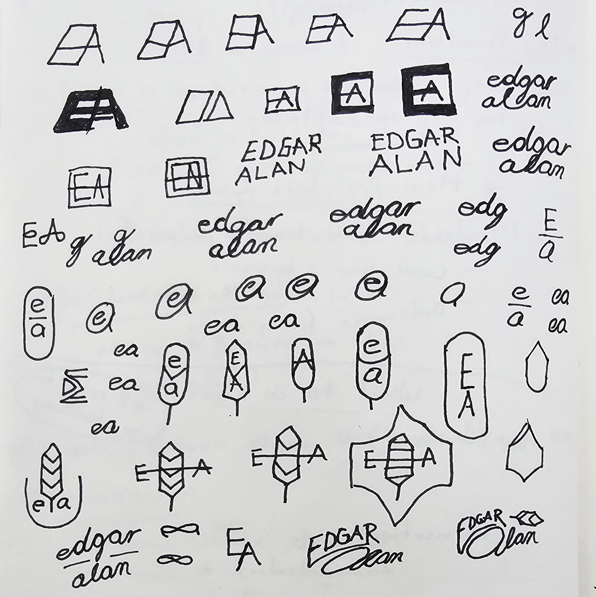
Sketching the Concept
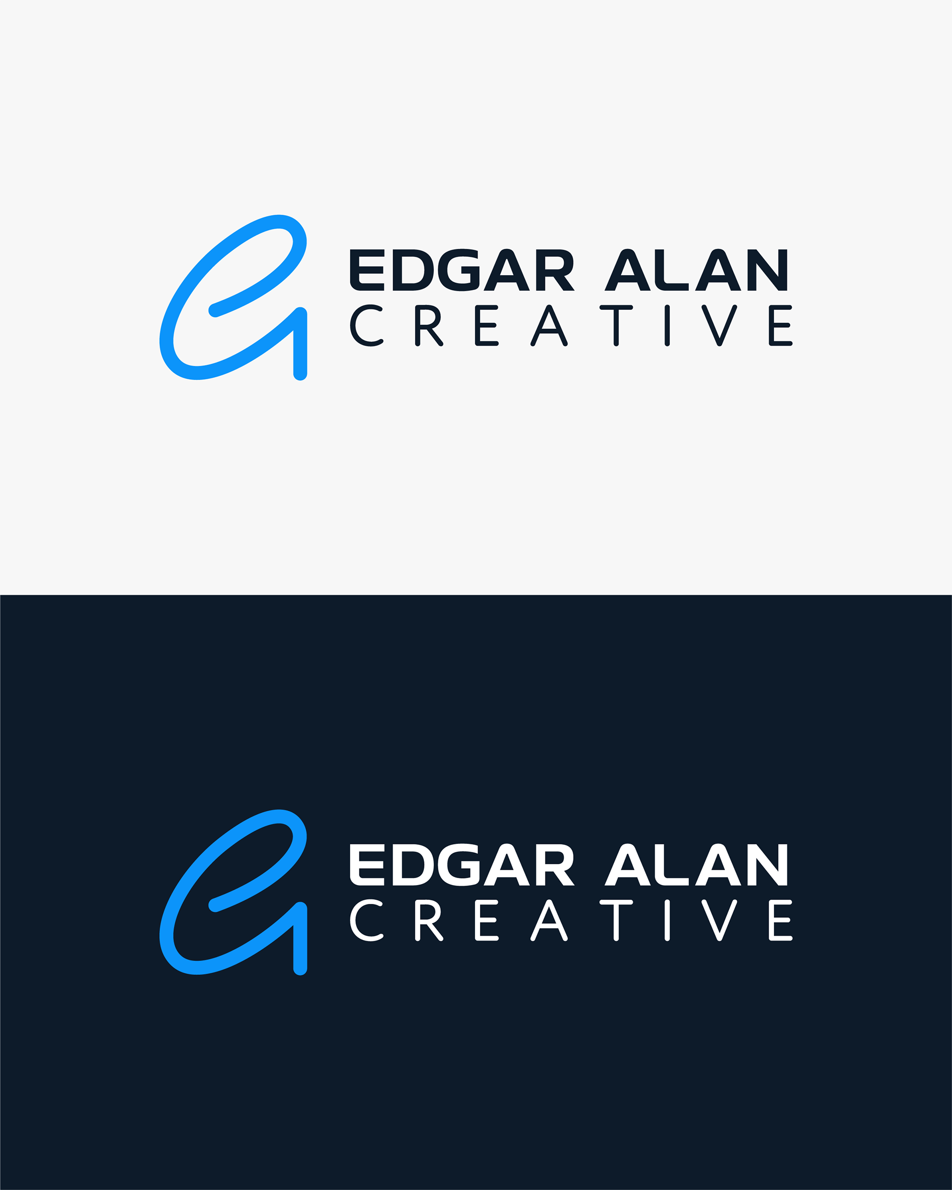
The process started with pencil and paper. I knew I wanted a logo mark that felt simple and personal. Combining the letters "E" and "A" into a single form felt like the right direction. I explored different ways to connect the two until I found a shape that felt organic, balanced, and natural, almost like my signature had evolved into a logo.

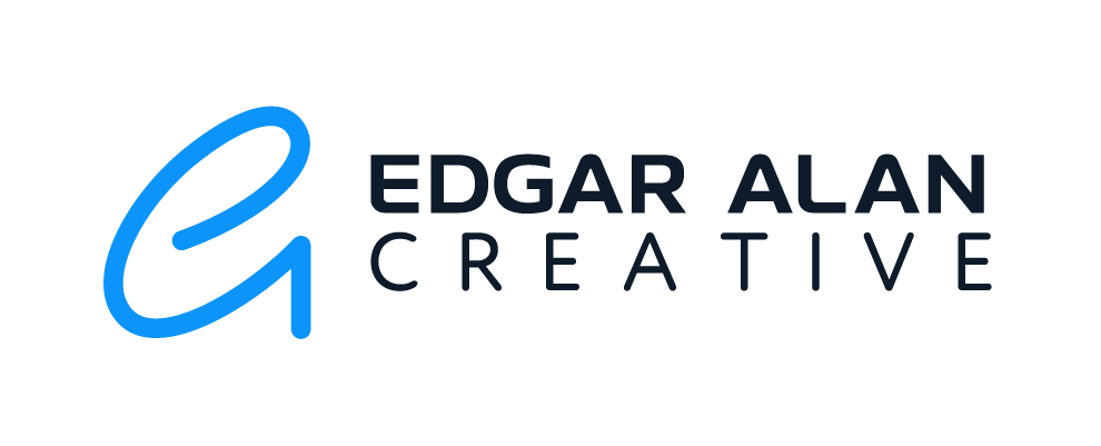
Developing the Brand System
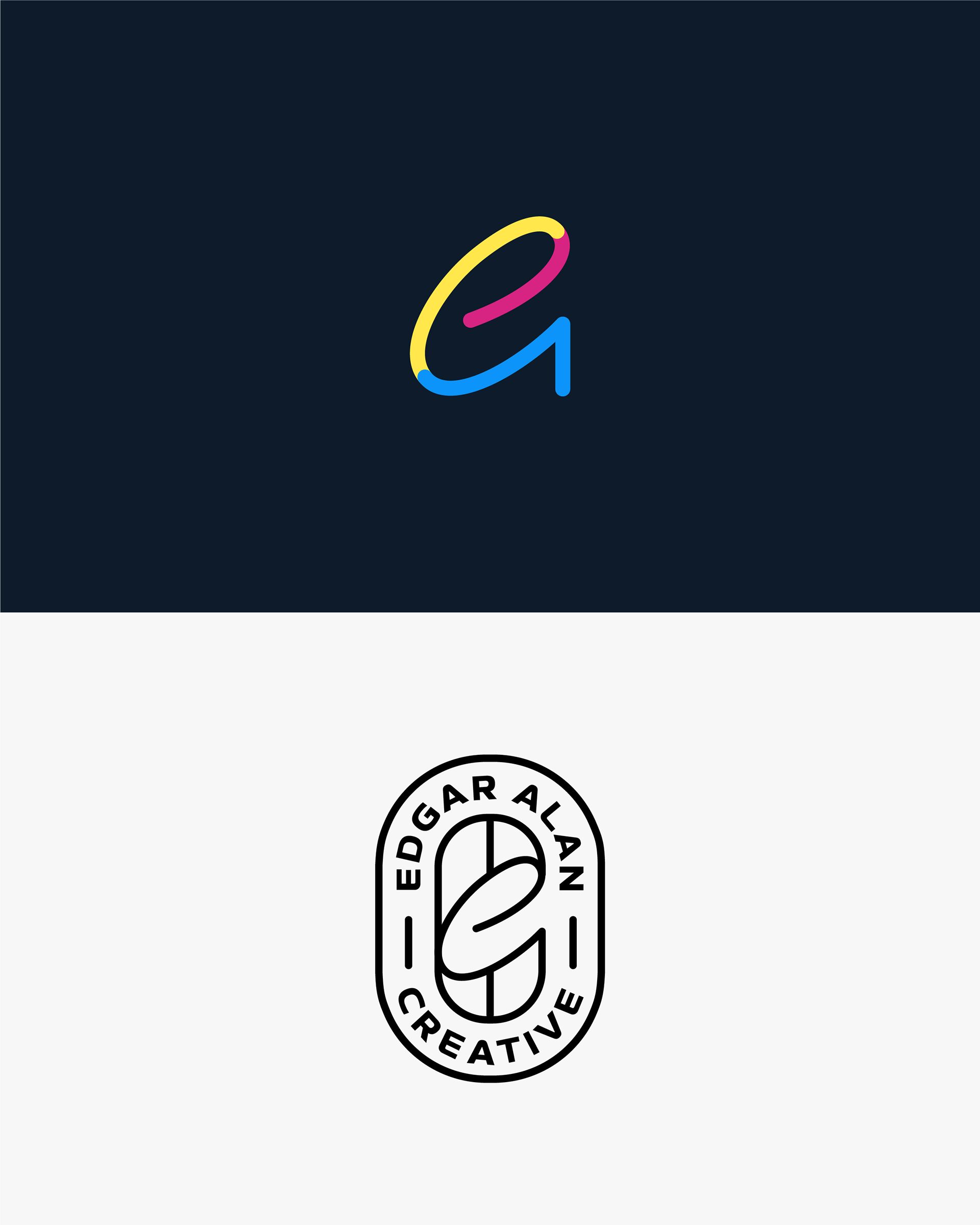
Once the logo mark and type were in place, I built a brand system to bring it all together. I chose a color palette that is bold, joyful, and personal, reflecting my personality and my cultural roots. This brand system feels like the right foundation, and I am excited to keep evolving it as my work grows.